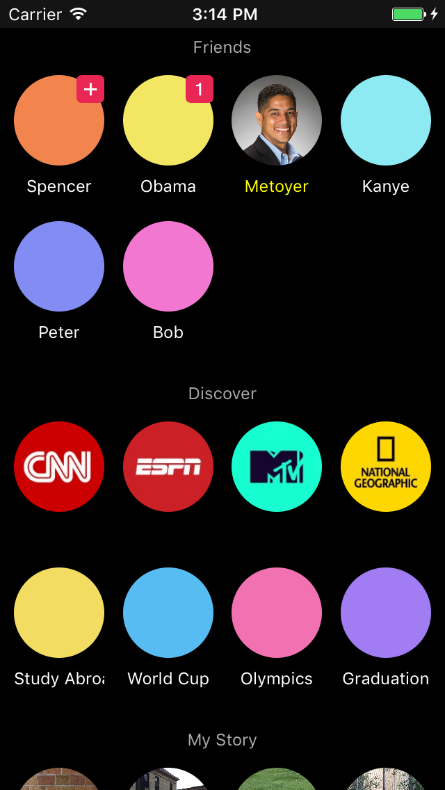
Snapclone
Human Computer Interaction (CSE 40424)

Source code on GitHub.
Why
We thought the Snapchat app could use a more efficient design. In particular, we wanted to improve the workflow for reviewing snaps and messages. We developed this UI prototype for our final project.What
I was inspired by Eliss, a game that involves merging bubbles; Snapchat is a fun app, so I thought bubbles were more appropriate than a table view. There is also an added benefit of better information density.We thought the seperate screens for snaps and stories was redundant. The bubble-for-each-friend metaphor allows snaps and stories to be collected in the same place.